Mobile traffic has skyrocketed over the past few years, making up more than half of all global internet traffic.
And this is especially true for car dealers.
Whether you’re looking to buy a car or book a service appointment, more and more consumers are starting their digital journey with your brand from their mobile devices.
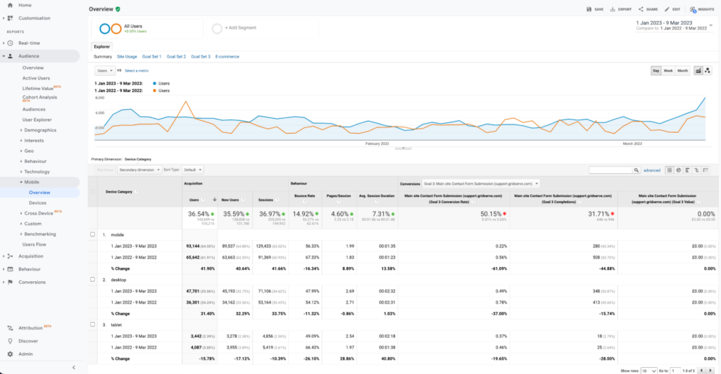
Just head over to your Google Analytics dashboard and you’ll probably see more than 60% of visitors browsing via a mobile device with that number growing year after year.
The bottom line: you can no longer afford to focus on desktop traffic alone.
And with desktop users significantly more likely to convert than mobile ones, boosting traffic alone when it comes to sending more visitors from mobile to your homepage or landing pages likely won’t have the same effect as boosting desktop traffic. This is where mobile conversion optimization comes in.
With the right approach, dealers can improve their mobile site’s performance and ensure that traffic converts more effectively.
So let’s dive in. Here are 4 quick and simple ways you improve your mobile conversion rate.
#1 Design with mobile in mind
The truth is most websites are designed and built on desktops. And as website managers, we spend most of our time viewing our site from a computer or laptop. So it’s easy to overlook how your website may look on a mobile device.
An effective way of ensuring that your website delivers an optimal experience for your mobile traffic is to test it on real mobile devices.
Testing on real devices enables you to identify and resolve any issues or discrepancies that a user may face when browsing from a mobile.
It’s best practice to run every user scenario on as many different devices as you can so that customers can experience effortless, effective browsing irrespective of their mobile device.
A couple of scenarios you can test include:
- Navigating and browsing numerous car detail pages
- Interacting with valuation and calculator tools you may have on the site
- Booking a test drive or service appointment
- Browsing blog pages
If you find that your site doesn’t look as great on mobile as it does on desktop then you may want to look into implementing a responsive layout.
A responsive layout allows your website to rescale itself according to the device being used to view it. This makes the website adapt to different screen sizes without any issues.
#2 Simplify your webforms
We’ve all had a bad experience with web forms, especially on our phones.
Maybe the fields were too big or too small, they wouldn’t let you type in them or you had no idea what information you were supposed to input.
These issues keep people from taking the next step with your brand and the reality is if your forms aren’t mobile-friendly, you’re probably missing out on conversions.
To give your mobile users the best form experience, follow these guidelines as you build your mobile forms:
- Build forms with mobile-friendly dimensions. While mobile devices give you some leeway on height, it’s recommended to build mobile forms with a maximum width of 400px.
- Create touch-friendly form fields and buttons. Make sure all fields and buttons (including your close button!) are large enough for your visitors to comfortably click.
- Give users some space. Leave enough space between form elements to prevent users from touching the wrong field or button. Also, add extra padding around your text to make sure that it doesn’t cut off on any devices.
- Test your forms on mobile devices. While simply resizing your browser window can approximate how forms look on mobile, running tests on a real mobile device provides the most accurate results.
#3 Utilise alternative conversion tools
When a potential customer comes to your website for the first time, if a form is the hurdle they need to jump through to transact with you – or just to talk to you – you’re creating a bad first impression.
Imagine you’re in a showroom and before you can buy something, or even ask a question, you have to fill out paperwork. Painful.
That doesn’t make any sense, right?
So, why would you rely solely on forms for your website? Especially when they’re proven to be less effective on mobile sites.
By utilising alternative conversion tools such as live chat, you’re essentially creating a second route for people to convert.
The purpose?
To catch those visitors who don’t want to fill out a form and wait for their questions to be answered. Or maybe you have visitors who are ready to buy right now, and as soon as they see a form, are turned away.

With an on-site messaging channel, you can proactively reach out to people who want more information from you or are browsing high-intent pages and give them a fast lane to your team.
#4 Continue the conversation off-site
One upward swipe.
That’s all it takes for your mobile traffic to leave your site (and close their browser). And as there’s no mouse to track when someone is about to leave your website, typical abandonment tools like exit intent pops aren’t an option.
Which is why considering a mobile-first messaging channel like WhatsApp or SMS helps you convert more mobile traffic by inviting them to continue a conversation off-site via a native app on their mobile (which they’re already actively using daily).

By incorporating WhatsApp and SMS calls-to-action (CTAs) across your site and on high-intent pages (such as car detail pages or appointment booking funnels) on their mobile website you can not only capture the attention of your mobile visitors but also engage them in conversations that can continue long after they’ve left the site. Increasing the likelihood of conversion.
Want to see how WhatsApp or SMS could improve your mobile conversion rate?